


Upon students’ return from winter break, a change was seen in the classroom of Ms. Kelly Krawchyk, tenth-grade history teacher. When entering the classroom, many of her students were greeted with the news that Krawchyk’s room had been repainted, and not with the white color that is used in every classroom. Her classroom had been repainted with vibrant new colors.
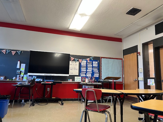
New paint colors have been selected to paint her room; not just one, but two. One was a bright, vibrant red, and the other was a warm gray. In certain light, the gray appeared to become a light purple shade from the red reflecting off of it, and the red looked more orange. The front wall of her classroom was painted red, and the other three walls were painted gray. The colors were presumably chosen as they are the school’s colors, and fit with the overall theme of loyalty to the school. As the alma mater states, students will always cherish the school, and so the colors will further the idea of manifesting what the school stands for in the classrooms.
“The inspiration for painting the classroom wall was we were looking to make improvements in the high school, and then we just went through and had all of the lights replaced throughout the building, so now we’re looking to go and repaint all of the classrooms,” Mr. Steven Mott, high school principal, said.
According to the McLean Company, a family-owned business, red is a negative color to paint walls as it can spark anxiety and restlessness.
Over the weekend of Feb. 1, the red wall had a section painted gray. In Krawchyk’s room, there is a section of the wall that protrudes from the rest of the wall, and it’s at the top of the wall. The bottom of the wall was still red, and then the blackboard separated that from the gray section at the top. The spot where the outcropping ends is where the red begins again.
“I actually really do not like it. It bothers my eyes because of the fact that it’s only gray in the middle and then there is a little bit of red at the bottom,” Jaiden Ingold (10) said.
The new stripe of paint caused students to draw their eyes up to the red that was peeking out of the corner of their vision.
“I like the intention of trying to freshen up the building, but I think the red is a very strong color and for many students, it has been bothersome to look at. It’s given people headaches, it’s hard to focus and it’s not exactly a calming color, so I’m not exactly a fan of it on the wall,” Krawchyk said.
Krawchyk sent out a survey to her students on two separate occasions to see what their views were on the wall. For the first survey, out of the 79 responses, 67% said they found it difficult to focus during class and 32% said they liked the change. 80% of students also said they would prefer the walls to all be painted gray, rather than having three painted gray and one painted red. 20% of students said they liked having three walls gray and one wall red. The majority of students said that it was distracting and didn’t create a healthy learning environment.
“I think [the color is] really scary and intimidating,” Chelsea Parks (10) said.
Other students enjoyed the change, saying it was unique. The color may be different, but some people like how it brings color to the room.
“Honestly, I really did like the red wall, I was feeling it. They should bring it back,” Michael Humphrey (10) said.
No matter what decision is made about the wall color, students will continue to adapt and adjust in order to utilize their learning experience the best they can.